“Georgia O’Keeffe” Exhibition Review by Ludovica Colacino

Georgia O’Keeffe. It’s part of the human nature to try and categorize a subject in order to understand it in depth. Though, there is an exception to this unwritten rule of human behavior: rationalization, however, it may increase the separation between a subject and its viewer – which will inevitably lead to only a projection of what we think it’s real. Georgia O’Keeffe was an artist that critics have struggled to put in a determined artistic movement – today we refer to her as the American icon of modernism, even if it covers over one hundred years from the 1850s to roughly the 1960s. O’Keeffe’s extensive archive and studies show how she kept herself distant from the majority of the artistic movements and groups, but only channeled her true self in company of her partner, the American photographer Alfred Stieglitz. Alfred and Georgia’s intimacy is reflected in the works of both of them: Stieglitz would often ask Georgia to pose for him and focused his attention on her hands, face, or her body as whole. Their artistic exchange was mutual: while we do not see Alfred portrayed in O’Keeffe’s work, we can still acknowledge his presence in her paintings and the atmosphere that certain elements conveyed by the way they were represented.

Georgia is very hard to understand rationally, mainly because her art doesn’t have a rationalized source, even if it relates to reality; the figures we see today on her canvas acquired their shapes as they were painted, only gaining a definite – yet most of the times still abstract – figure as she was creating them. With her artistry we see the sense of hearing being actively engaged for the creation of her own paintings – which were, as she said, a translation of music for the eyes. Her deep relationship with synesthesia – having a sense stimulated by another – accompanied her for the whole length of her artistic career; she would see music as vivid shapes and put them, consequentially, onto paper. This process elevated Georgia by the other artists, building another wall of separation between her paintings and their meanings. The viewer can only imagine what Georgia felt while hearing the music, but it is unlikely, if not impossible, to completely understand her and her art through her paintings only – even if she is completely transparent to the public and the critique. Although Georgia would meet herself and her true self-expression whenever she painted, she wouldn’t ignore the public opinion about her: her definite lines and fluid – sometimes symmetric or spiral shaped – shapes may have been evoked by music, yet the critics’, especially the feminist ones, interpretation of her art would constantly verge towards eroticism – sparking the idea that Georgia O’Keeffe may be a feminist icon. The lack of consideration for women artists has left the position of “woman icon” empty for painters – while the men counterpart would have a greater coverage and acknowledgment of their works. Coincidentally the fist-wave feminism started its activity in the late 19th century, early 20th, exactly when Georgia was experimenting with her abstract paintings. Regardless of the numerous times she affirmed that her paintings were not erotic and she was not a feminist, she eventually decided to paint with a more photographic and realistic style, focusing her attention to still life in particular, but also exploring landscape later in her life. Synesthesia didn’t abandon her when she temporarily stopped painting with an abstract style; her senses were still engaged actively, but in a way that also implied a stronger influence by memory and emotions. She started painting flowers around the 1920s – especially following the Wall Street Crash of 1929. Her interest in the city dissolved in 1929 also because of her first visit to New Mexico, from which the viewer witnesses a turning point in her style. Before that, however, Georgia oriented her artistry towards what has been – and still was – overlooked by the citizens of New York or of any other city: nature, especially flowers. Her flowers fill every inch of her canvases, forcing themselves in the attention of the rushing citizens.
As she remarked:

Nobody sees a flower – really – it is so small – we haven’t time – and to see takes time… So I said to myself – I’ll paint what I see – what the flower is to me, but I’ll paint it big and they will be surprised into taking time to look at it – I will make even busy New Yorkers take time to see what I see of flowers… Well – I made you take time to look … and when you took time … you hung all your own associations with flowers on my flower and you write about my flower as if I think and see what you think and see of the flower – and I don’t.

The importance of looking and seeing echoes past artistic movements such as impressionism and post-impressionism – which transitioned the beginning of modernism – but Georgia would see the world around her differently than her predecessors. She wouldn’t paint the landscapes before her en plain air, but she would store the memory of what a place conveyed to her in her mind in order to paint from memory. What we see on the canvas, eventually, is not meant to be a representation of reality as generalized – what we see is what she saw and attempted to make us understand from a position far from any other political movement or instance – and Tate Modern is giving us a rare chance to approach Georgia O’Keeffe and her paintings more closely than ever before.

Exhibition, room by room.

Tate Modern is currently hosting one of the most extensive exhibitions ever realized about Georgia O’Keeffe, gathering over one hundred of her paintings. The first room was arranged to resemble her first exhibition at the gallery 291 in New York, year 1916. The gallery was owned by the photographer Alfred Stieglitz – who was introduced to Georgia’s art by one of her friends from school. The room is poor in lightning and shows a green drape adorning it all around it; above it we can see Georgia’s drawings which were, at first, abstract swirls drawn with charcoal onto white paper and watercolor paintings. The following room represents fully the determining importance of abstraction to Georgia’s paintings: the viewer can see the strong presence of synesthesia by the vibrancy of the colors and the way they blend into one another. Georgia’s paintings would often represent subjects with a sharp edge against the hues and the blends of other colors, almost giving a perception of a trembling spectrum, or fabric, to the soundwaves of music.

Tate allows to viewer to explore the relationship between Georgia and Alfred in the following room, the fourth one, by exposing a mixture of the works of the couple: Alfred’s pictures of Georgia evoke such intimacy that the viewer acquires the role of voyeur, perhaps. Alfred has not been represented directly in any of Georgia’s paintings, but it is believed that he is depicted in her still life paintings, under a specific code, or symbolism, only known to them.

Even if Georgia was more driven to follow synesthesia for her paintings in more of an abstract way, in the fifth room the viewer can see how she had a strong attachment with reality as well by representing the city of New York, especially at night. Most of the images were painted on long and narrow, vertical, canvases contributing into enhancing the height of the skyscrapers. Some of the paintings feature a glowing full moon, peeking behind the clouds – which light is resembling the satellites. Georgia’s interest in New York was raised during the “roaring twenties”, continuing to paint cityscapes for the rest of the decade. It seems that the painter wanted the viewer to compare the street lights to the moon, as the they are put on the street level.

Georgia finds her connection with nature again with her trip to Lake George with her husband Stieglitz, staying at his family house in summer and autumn. The changing season has allowed her to have an extensive variety of colors on her palette – which are now less saturated than her first abstracted period. Considering Georgia’s sensitivity to the world that surrounded her and the intensity the perceives it, it’d not surprising to know that she remarked ‘Here I feel smothered with green’ in relation to her stay at Lake George.

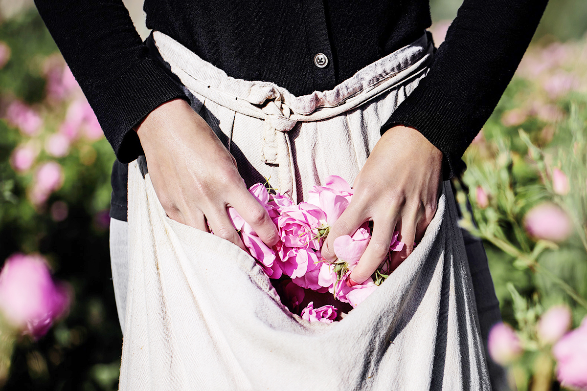
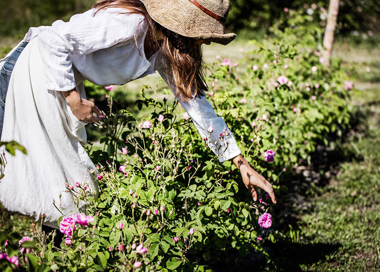
After her experience at the lake, Georgia presents a heavy shift in style – reinforced, also, by the critiques’ interpretation of her abstract artistry as erotic – presenting figurative subjects that are more realistic: the flowers. In the 1920s cities were heavily urbanized, and, consequentially, the citizens were more focused on work than nature – the flower is a very common element in the everyday life, often dismissed by the public attention. Georgia directs the human eye back to it with her still life paintings of them.

Having visited New Mexico once in 1929, Georgia found herself travelling back to it numerous times; she remarked that it was her country and that “[she] shouldn’t say too much about it because other people may be interested and [she doesn’t] want them interested.” Which makes us understand how although she shared her views with the world, she was reluctant in sharing the placed that inspired her.

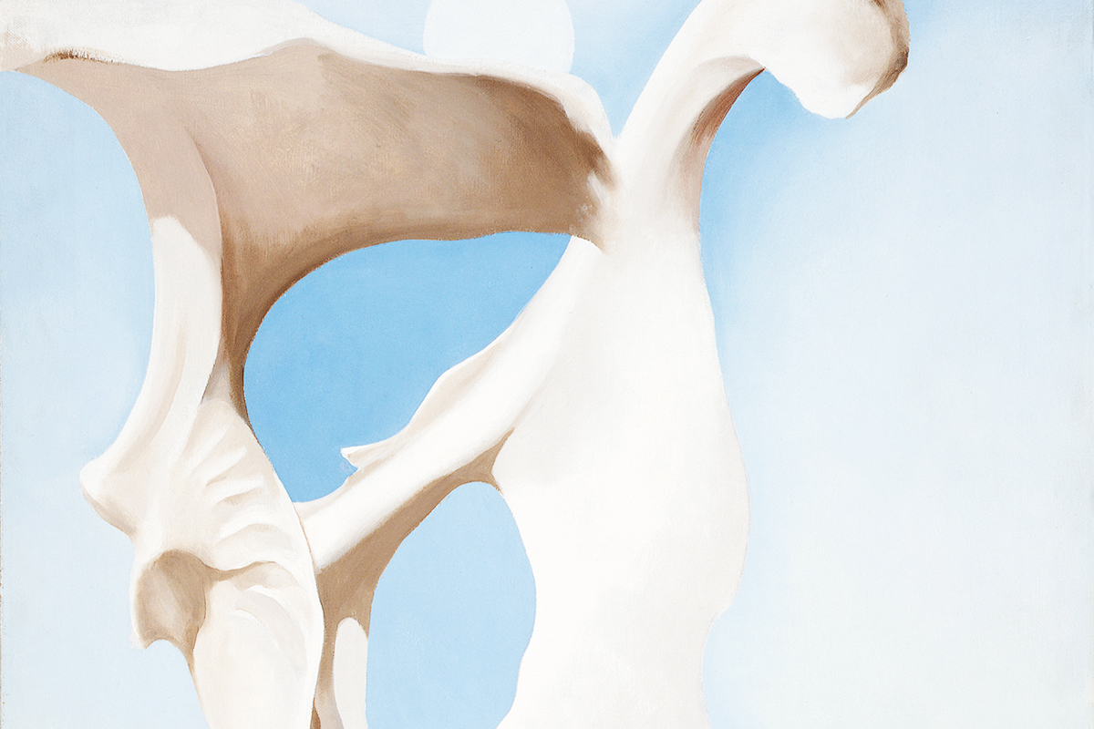
In the following rooms the viewer acknowledges her connection with New Mexico by the incredibly vast selection of paintings about its landscape that she created over the course of the years. Some recurring element were the skull, the bones – which she collected instead of flowers – countless cliffs and hills in the distance. The repetitions in her paintings allowed her to discover more and more of a determined subject, shaping it in her own mind and engaging with it to understanding it in depth – this happened with the mountain Ghost Ranch, and the “Black Place” and the “White Place” in the Navajo country.

The exhibition closes the circle by showing her late abstracts and skyscapes in the final room; these works were produced between the 50s and the 60s – there’s a painting in particular that represents what the view from the airplane she would take to New Mexico conveyed to her, which shows a particular attraction towards the view of the sky above the clouds.

She stood between being understood by the public and her own artistic experience; wanting to be understood as her true self and not being depicted as somebody else is one of the many crossroads of Georgia’s life. Georgia was more bounded to reality yet her sensitivity as a painter makes her shift away from anybody’s attempt to put her in a box, to define her, her art and its meaning. It’s impossible to trace a line and circumscribe her activity as definitive under one point of view. Georgia’s art is a spectrum of emotions, music, visive elements only she had access to.

– – –

Written by Ludovica Colacino for Fashion Philosophy, Issue 3. The above image is of an original painting by Georgia O’Keeffe, that displayed at Tate Modern until 30th October (2016).

All rights reserved. No part of Fashion Philosophy publication may be reproduced in whole or in part without a written permission. Featured content is protected under a Creative Commons Attribution / Non-Commercial / No-Derivs International License. All views expressed in Fashion Philosophy are of the respective contributors and are not necessarily shared by the editors and fellow contributors. © 2016 Fashion Philosophy.

“Gender by Design”, by Emily Stoker

Gender by design. Fashion is a new way into the feminist conversation. With designers such as Timur Kim, and Grace Wales Bonner, furthering the new feminist agenda by creating clothes that unite rather than divide. Their designs elicit a sex-positive strength that reinforces the gradual dissolution of gender binaries in the fashion industry. Supporting their efforts are independent publications such as The Gentlewoman, and Riposte, who encourage the application of feminist thinking in all areas of the arts, both online and offline. The growing support from the editorial industry is crucial, as it motivates artists with similar principles to create enduring, referential and self-explicating work. Moving our culture and communities towards a shared value system based on equality and helping gender bias to dissipate.

The aforementioned designers are in good company, as they work with their teams to ensure equality is maintained throughout the entire design process. Using feminine and masculine reference materials to plan and develop concepts for their collections. Filtered into pattern cutting and construction techniques which give greater flexibility in shape and silhouette. Unisex brand Timur Kim adopts a similar design process, allowing the individual to build their own aesthetic identity around the fabric of the clothes. Technically, this requires an acute awareness of body shapes and an appreciation for diverse physiques; something designer Telfar Clemens uses to inform his collections. He thinks about “both genders when designing and decided what they both have in common to design a genderless uniform of sorts”. Creating purposeful, ’simplex’ clothing that reflects his inclusive approach to people; making pieces that are equally as attractive on male and female forms.

Telfar’s diversity in design is graphically depicted in the promotional video for his SS16 collection, showing CGI animated figures of himself transformed in a variety of gender, race and body types. This is a form of non-gender bias branding, which makes Telfar a new feminist by default. Dressing individuals for their character, rather than their gender; and celebrating strength and weakness in all statures. With garments as his medium, Telfar is able to communicate his vision to a wider audience. Designing with difference in mind and pulling inspiration from diverse disciplines to emerge with objective concepts that naturally overcome binary constructs of gender.

Astrid Andersen is another designer who adopts a similar polymathic way of working. Using masculinity as her mutable topic; she elevates her audience and aesthetic to a place where gender becomes secondary. Balancing out sex-stereotypes with a combination of delicate emotional sensuality and primal sexual energy, or what she calls “masculine attraction with feminine references”. She creates a space for her garments to take on their own identity based on personal preference, rather than didactic gender norms. Inclusive in its nature, the process tunes into the new feminist frequency by transforming our perceptions of masculinity. Astrid believes that this is “the natural progression of guys in the street, when you look at them today, there is no real relevance of gender”.

This encourages us to look at concepts of feminism, gender and masculinity in a new way; slightly shifting our perspectives to make room for change. With clothes that have the potential to cultivate empowered communities; enriched by direct experience of gender design. What makes Astrid and Telfar attractive as designers, is that they create with equal regard and respect for all genders and orientations. Which inspires in us, a greater appreciation for all embodiments of the human form. They do this, not through force or manipulation, but simply by maintaining authenticity in their design process.

*

Written by Emily Stoker for Fashion Philosophy, Issue 3. The above photograph is from Timur Kim‘s SS16 collection.

All rights reserved. No part of Fashion Philosophy publication may be reproduced in whole or in part without a written permission. Featured content is protected under a Creative Commons Attribution / Non-Commercial / No-Derivs International License. All views expressed in Fashion Philosophy are of the respective contributors and are not necessarily shared by the editors and fellow contributors. © 2016 Fashion Philosophy.

“Body Honesty”, by Abi Buchanan

Body Honesty. I’m going to say it. The word that has women quaking in their boots, living off black coffee and cashew nuts, gulping air for lunch. Fat. The word that’s the strongest weapon in anyone’s arsenal, the insult that’s guaranteed to hit where it hurts. This is the word that taught us a BLT is ‘naughty’, and that allowed a diet industry worth 2 billion pounds to flourish. In February 2016, I attended London Fashion Week. I wandered spellbound around presentation after presentation, seeing racks of beautiful clothes in a size I usually reserve for my feet: a tiny 4, contrasting starkly with my cumbersome 12. I could probably fit one thigh in the dresses, one arm in the trouser legs. Women this size, had I not seen them in the flesh, could be creatures of myth.

My self-consciousness was further exacerbated at a show I attended one afternoon, where I, the event photographer, was mingling and snapping the guests. I knew no one and so was sitting by myself drinking a beer (a FREE beer) while my fellow fashionistas looked on with distaste. How many times, Abi, have you been told not to drink your calories? The other girls didn’t say ‘hello’ to me – it’s a dog-eat-dog world – but I was loitering, more socially desperate than I think I have ever been in my life, my determination to network palpable. The photographer came over to take a picture of the women I was standing with and, I kid you not, deliberately took one with me just out of frame. Realizing he had done this almost by proxy, he gave me an apologetic smile and motioned for me to join – but it was too late. It was now a pity party.

I scuttled back to the cloakroom, my charity shop £5 leopard faux-fur hanging next to a leather Acne Jacket, and something sequined by Ashish that I just know I could never pull off. I walked out with my tail between my legs, an all-too-familiar thought creeping over me: I will never fit in. This is a fashion publication, and so it’s fitting that I’ve talked about high fashion. But that sentimentI am not good enough, I am not thin enough, I am not anything enoughechoes far beyond the skinny, unreal, elitist world of Fashion Week. Among women today, it is almost universal.

When I was a little wisp of a 10-year-old, my Grandmother presented me with a newspaper clipping that I kept on the pink, heart-shaped gingham noticeboard above my bed for 8 years. The article was by Melanie Reid, ‘The Times‘ journalist, left tetraplegic after a riding accident in 2010. Without the use of her legs, and with only partial use of her arms, she wrote about looking back with frustration on her teenage years spent worrying about the size of her thighs.

I’ve been in a lot of different places: obsessively counting out almonds and eating only 0% fat yoghurt and green veg, eating Dominoes at 3am several times a week and hiding crisp wrappers down the side of my bed, attempting to not eat all, attempting to eat everything. I’ve survived someone approaching me on a night out, uninvited, and saying “You would be hot if you weren’t a little fat.” The irony being, of course, I’ve never in my life been fat. I’ve amassed earrings and shoes because then I don’t have to make things fit over my hips, contain my boobs, hide my tummy and then look flattering, to boot. I don’t have to worry about the little black numbers that seem to creep up and down of their own accord: 8, 10, 12, 14, beyond. A trip to Topshop, in my head, is on the same level as a trip to the dentist when you know you have to have something unpleasant done to your molars, or being told I have to repeat my GCSES. I have a theory that you have to be an extra-terrestrial creature to look good in things from Topshop, or just not have hit puberty. Those funny high-waisted jeans with no pockets are doing very few people any favours. “You look gorgeous! Take a selfie!” orders the pastel-pink decal stuck over the changing room mirror in the brutal Oxford Street building. I don’t look gorgeous. I look like the Abzorbaloff from Doctor Who. And this is from someone who loves shopping.

It’s no revelation that we’re taught hard and fast that our worth is dependent on our appearance and so I’m destined to forever feel that my warmth, my intelligence and my humour all come second to the chub that spills over the waistband of my jeans and the pink stretch marks that have snaked along my inner thighs, like I’ve outgrown myself. It will also come as no surprise that no matter whose affirmation we seek – friends, mothers, boyfriends, the unkind abyss of the internetthe most important person we should be listening to regarding our bodies is ourselves. I hope I’m not alone in internalizing anything unkind that’s said to me and not even listening to the people that love me, who want the best for me and who think I’m beautiful just the way I am.

I started this article a couple weeks ago now, feeling very ill at ease in myself. I’m finishing it now feeling completely different. Have I lost a huge amount of weight? The answer is no. Do I look any ‘thinner’ to other people? Probably not. What changed, what really had to change, was how I treated myself. I’m at a point now where I don’t know how to finish this piece because, like any one of you, I’ll never have all the answers. I don’t think I’ll ever be at a point where I can give a lecture on body-positivity and I don’t think I’ll ever not feel guilty if I eat three consecutive doughnuts. But I will say this: we can be mean to ourselves. Horrible, in fact. The things I thought about myself were not things I would ever say to a friend, and it’s definitely time to be a friend to myself now. It’s time to come clean: the way I’ve treated myself through my teenage years has not been a case study in self-love and feminism, it’s been a case studying in self-loathing.

We have some serious ground to cover – there is still a whole host of issues surrounding occupying a female space, especially one that’s (gasp) isunapologetically large. The plus-size fashion industry is booming, but as many of you will know or have experienced, ‘plus-size’ models are frequently a teeny size 12 and mainstream collections are still focused upon making fat bodies look thin – we’re subversively told that plus-size bodies are shameful and should be altered or hidden. There still isn’t the creative, expressive fashion available for women who are a size 18 that there is for women who are a size 8.

As a young woman, I sometimes felt that my body had ceased to be my own. In order to reclaim that, I had to be kinder to myself. I think it’s a myth (and a cliché) that no one will love you until you learn to love yourself, but I do think having the latter tucked away inside you – a quiet, steadfast assurance from yourself that you deserve something wonderful – helps you look for love in the right places. Let’s start with being kind. Let’s radically change the way we talk about female bodies. Let’s renounce WeightWatchers and Diet pills from Boots. Let’s be kind about women we see in magazines – the world is unkind enough to them already, and we have the power to be nice. Most importantly – most radically – let’s be kind to ourselves. When all is said and done, for the most part, my body does its job perfectly. I am able to run, even though I avoid it at all costs. I can squeeze my hands into fists and wrap my arms around people. I can go for winter walks with my family and return home red-cheeked from the cold. A very slight alteration in this delicate chemistry would leave me unable to do all the things I take for granted. I have nothing, at all, to complain about.

*

Written by Abi Buchanan for Fashion Philosophy, Issue 3. The above photograph is sourced from The Lonely Girls Project.

All rights reserved. No part of Fashion Philosophy publication may be reproduced in whole or in part without a written permission. Featured content is protected under a Creative Commons Attribution / Non-Commercial / No-Derivs International License. All views expressed in Fashion Philosophy are of the respective contributors and are not necessarily shared by the editors and fellow contributors. © 2016 Fashion Philosophy.

“Loving Your Lines”, by Amy Jackson

Loving Your Lines. For centuries, women’s bodies have been under scrutiny, and society typically focuses on a perfectly smooth, hairless, curved in all the right places female body, resulting in surprise and often shock when faced with the true human form in all its spotty glory! In recent years, however, there’s been an increase in people’s acceptance and honesty towards their bodies, and amongst other breakthroughs such as body diversity, stretch marks are finally being celebrated.

Stretch marks are an inevitable part of life that almost every person encounters in some form. They can happen for lots of different reasons, such as weight gain, muscle gain, weight loss and pregnancy, and to people of all shapes and sizes. Chrissy Teigen hit headlines last month after posting a Snapchat that revealed her post-childbirth stretch marks, proving even models aren’t perfect, and just as human as the rest of us.

This celebration of stretch marks has been an artistic inspiration for many. Photographer Chloe Newman, has created a series of images that highlight the beauty of the natural female body, photographing stretch marks paired with glamorous lighting and with a touch of glitter; because what says celebration like glitter? The photos were used in collaboration with Polyester Zine, who’s Editor-in-Chief, Ione Gamble, allegedly suggested the photoshoot should be done as if shooting a fashion accessories editorial, resulting in final images that depict stretch marks with the same beauty as a Gucci handbag, minus the hefty price tag.

Love Your Lines is yet another phenomenon hoping to erase the shame associated with stretch marks. Having launched in 2015, #loveyourlines is an Instagram page curated by Alex Elle and Erika Layne that’s dedicated to posting beautiful black and white portraits, featuring the bodies of women and men proudly showing off their marks. All of the images are submissions from people around the world who want to share their story and let others know they’re not alone in their insecurities.

*

Written by Amy Jackson for Fashion Philosophy, Issue 3. Featuring a photograph from Love Your Body” published on Oh Brenda! blog.

“Alessandro Michele & Gucci”, by Amy Jackson

Alessandro Michele & Gucci: the Michele Effect. Fashion Philosophy’s Amy Jackson investigates Gucci’s growing popularity under its Creative Director, Alessandro Michele.

*

Hailed as the highest selling Italian brand, Gucci is a name that’s always been synonymous with luxury. Whether it be their leather loafers or bamboo-handle tote bag, it’s likely most fashion lovers have a soft spot for at least one classic Gucci item.

When Frida Giannini, the labels beloved creative director of many years was forced to leave the brand due to a decline in sales, Gucci looked to a new designer to pick up the pieces. The decision to appoint unknown designer Alessandro Michele as the new creative director of the brand was a surprising one, especially with such big names as Ricardo Tisci, Christopher Kane and Hedi Slimane being rumoured to take the spotlight. The buzz surrounding Michele’s new role, however, was high, and many believed his unknown stance in the fashion world was one of the reasons for the attention and excitement around his debut collection.

Michele’s first collections reflected a mixture between classic Gucci and a vintage, androgynous spin. The designers debut Womenswear collection was a far cry away from the luxurious Italian glamour of the brands previous collections. An eccentric mix of clashing prints, sheer delicate fabrics and masculine details, paired with gucci logo belts and fur lined loafers gave a breath of fresh air to the brand and a distinctly youthful feel.

The newly found appreciation for all things Gucci has been aptly labelled the Michele Effect. Michele’s vision of a new Gucci, has caused revenue to rise by almost 12 percent in 2015. People who ignored the brand in the past have now been drawn in by playful, colourful garments and their charming wearability. Gucci has ultimately become an it-brand, with the likes of Alexa Chung and Florence Welch being among the many celebrities seen dressed head to toe in the latest designs. Welch, having been recently unveiled as the new face of Gucci watches and jewellery, spoke about Michele’s talent in an interview with Dazed and Confused.

You really feel like he’s giving you a very personal view on clothes, fashion and the things that he loves. You feel like he is really giving you his heart with his collection, that there’s a story. And his celebration of femininity, masculinity and sexuality are quite different, in a way.”

Michele’s most recent Menswear collection for Summer/Spring 2017, inspired by travel, was just as vibrant and rich in detail as always, never straying away from the famous ‘geek-chic’ element that the designer brought to the table back in 2015. With each collection more exciting than the last, it’s likely that Gucci’s success will only continue to grow in Alessandro Michele’s hands, and the Michele Effect will remain in full swing.

*

Written by Amy Jackson, featuring ©Gucci (‘Tian’ collection) image.

“Bowie’s Band of Outsiders”, by Nicole Clinton

Fashion Philosophy‘s Nicole Clinton, considers David Bowie’s stylisation of the outcast and its effect on his followers.

*

No-one personified the intersection between fashion and music more than David Bowie. In fact, considering that his amalgamation of the two media verged on art and that he also dabbled in film, he could certainly be placed firmly in the centre of the Venn diagram of modern culture. He was one of those rare figures whose work marked a collision of pop-culture and high-culture. Following his death, the public lamented the loss of an icon and the legacy that was revered by many Bowie fans was that he showed the downtrodden outcast (that they themselves confessed to have been) that it was okay to be different. This, he most certainly did. However, was every person who claimed that Bowie helped them to accept their outsider status actually an outsider to begin with? Or did Bowie’s image make the strange so alluring that even a very average person wanted to see themselves as alien in order to feel touched by his genius? Or maybe it is the look, and consequent reputation, that is tied to the icon that attracts those who dwell very tentatively in between, to call themselves different so as to garner association to brilliance.

Fashion is a great visual representative of inner thoughts or feelings. A look can exude an attitude, a state of being or an ideology. It is not only a physical indicator of personal taste but also of membership to a social or cultural group. Bowie’s style very much played on the exhibition of the extraordinary to controversial effect. His Ziggy Stardust days saw him exploit androgyny audaciously; making women’s clothing and make-up part of his stage persona. The sexual ambiguity that Bowie wove into his public image constituted something that the mainstream public had never seen before and could barely comprehend. While he outraged and bewildered many, he intrigued those who appreciated his intentions from an artistic perspective and spoke to those who had difficulty finding their place in conventional society. Christening his band The Spiders from Mars and emphasising the space theme in his music and visual graphics, reinforced the metaphorical connection between not being from this planet and not fitting in. He explained the origins of his preoccupation with alter-ego: “I think my problem used to be that I was always shy and fairly awkward in social situations. All through my youth, I would use bravado and device- costume and flamboyant behaviour- in a desperate attempt to not be iced out of everything”. This testimony illustrates that fashion can do a great deal for the psychological state and social appearance. By performing as a fundamental tool in the creation of alter-ego (even the subtle alter-egos that we all use to get us through everyday life), it serves as a means of escape, a way to fool the psyche into believing that you are something that you are not. It makes you feel things that you wouldn’t otherwise experience and can turn even the most mundane routine into a phenomenon. For example, after Bowie’s death, his Spiders from Mars drummer, Mick ‘Woody’ Woodmansey, told RTE 2fm DJ, Dave Fanning, that “the presentation of the music ” was so vital to the icon that “ he got dressed as a rockstar for breakfast”, which illustrates the strong link between fashion and mentality.

Hence, the outsiders identified with what the artist was doing with his image and they viewed him as an almost Messianic force coming to save them from the ridicule and trauma of social exclusion. They no longer felt pressurised to conform because uniqueness could now be respected as innovative, stylish and exceedingly courageous. They employed Bowie’s blend of fashion and music to express and release their personal feelings of alienation but also to assert their membership to his fan club. Rather paradoxically, the star’s followers were united in a group by their shared sense of isolation.

However, like most prophets, it could be claimed that Bowie did not just lead existing outsiders; he converted people into them as well. This is where the complex element arrives as we ponder which came first for the individual; the outcast status or the Bowie infatuation? Essentially, it could be argued that he appealed to an additional group to those mentioned previously: average girls and boys who functioned rather unassumingly within the social structure, but found Bowie’s eccentric world infinitely more engaging. Bowie made the bizarre glamorous and unexpectedly attractive with Ziggy’s spectacular barrage of glitter, patterns and colours. In this way, a look can be so arresting that it can persuade someone to believe that they are, or can become what the look was initially designed to represent. Perhaps he offered salvation to these people who were floating around in the purgatory of the mundane, unaware of what the alternative to normality was. His “costume and flamboyant behaviour” lured them from the no man’s land between conservative life and alternative life, into the latter. Bowie loaned the notion of being alien a magical and intellectual reputation and this aura was transferred on to his community of fans. Many Jane and John Does now gazed with admiration at the outcasts that they had previously mocked; yearning to share their affiliation with Bowie’s brilliance – thus turning on the very society that they had formally accepted and been accepted by, without question. Not only did he provide an alternative to the boredom and disillusionment of traditionalism, but from a credibility point of view, being a Bowie fan made them seem more interesting, cooler and more unique.

Nevertheless, I am not trying to insinuate that the source of this group’s devotion is impure. Indeed, some may accuse those who reconsidered and rechristened their social status, after being seduced by style, of superficiality. But this is not an apt judgement because were they not more artistically enlightened by joining Bowie’s army of outcasts than they ever would have been under the control of group-think logic?

However, I am not suggesting that you had to be an outsider (or view yourself as one) to be a fan. With icons like Bowie, appreciation often transcends their own band of followers and radiates out to affect the mainstream audience and critics alike. But while the particularly pretentious members of the fanbase may condemn the thought that their conventional contemporaries are jumping on their bandwagon; they should not have a problem as long as the artist has not changed or “sold out” in order to find popularity amongst the general public. Commanding a mass audience does not pollute the realm of originality in which the icon dwells because mainstreamers simply admire their product from the outside instead of living in there like their followers and they have no intention of trespassing on their territory.

Not only did Bowie assign eminence to the outsider; he gave them a face, a look, an identifiable visual representation. He employed style to visually embody the strange and projected it in a glorious way. He glamorised the notion of not fitting to such a degree that you would contemplate why you would even want to fit in when being different could be this magnificent.

His image, and its contribution to society, raises questions about artistic representation. What did an outsider look like before Bowie’s vibrant, androgynous, glam-rock fashion manifestations? From a physical perspective, there were no explicit rulings as to what they were; only an understanding that they were anything that the conventional was not. Bowie played with this concept to form an image for the outcast that challenged all accepted social norms (sexuality, fashion, behaviour).

This depiction was more about the essence than the actuality as all outsiders were not necessarily labelled so because they were homosexual, bisexual, transgender, fashion experimentalists, libertines or reckless rebels in the way Ziggy’s image implied. Bowie’s stylistic decision to eccentrically invert tradition did for the outsider what illustrators did for nursery rhymes: they handed us striking visual associations to latch on to.

There is a deeper level to allowing oneself, or even choosing, to be enticed outside the margins of society by the alien. True, Bowie’s exotic image made life outside the box seem particularly exciting and artistic. But is this really enough to decline the ease and ‘comfort’ of fitting in? So if we remove the reason that it was merely an antithesis to boredom, there is something quite romantic about being an outsider. It can be a release of pressure by issuing a sort of pardon from society. It carries with it a degree of freedom that the brave search for. This liberation may seem rather terrifying to those who just want to effortlessly roll through life, mindlessly slotting into the roles that someone else has created for them and many others before them. But for anyone who finds this fate stifling, oppressive and unrewarding, perhaps this outsider status is the only way to unearth the originality that they seek.

One wonders if all cultured people are in fact outsiders. Maybe they pursue such a status because it tends to hold a reputation for producing artistic brilliance. Perhaps it is simply necessary to stand alone, to view the world from the outside, so as to create something marvellous, to know what has not yet been done and how to do it masterfully. If so, thank God that Bowie was an outsider. Not only did he use his art and his charismatic, exaggerated image to help outcasts to accept, flaunt and celebrate their differences; but his flamboyance inspired and touched many ‘insiders’, triggering a soul search as to why they should reject and challenge convention. If Bowie had not instigated this enlightenment, the world may not have gained many of the creatives that we venerate today. Whether the outsider status begot the Bowie fascination or vice versa, one thing is for sure: the outside was a dreary, lonely place before the icon’s appearance and with a flash of red and blue lightening and a sprinkle of stardust, he animated it.

*

Written by Nicole Clinton, with accompanied image of David Bowie.

“The Daring Buds of Dior”, by Nicole Clinton

The Daring Buds of Dior. One of our newly joined writers, Nicole Clinton, explores Dior’s fixation with flowers and the possible reasoning behind it.

– – –

From the time of its inception as a fashion house in December 1946, Dior’s collections have drawn inspiration from flowers and their related connotations. After showcasing his first collection in February 1947, the label’s founding father, Christian Dior, supposedly exclaimed: “I have designed flower women”. The brand’s reliance on floral configurations meandered its way through the last 69 years to culminate in a botanical extravaganza last autumn, when its most recent creative director, Raf Simons, exhibited his effeminate Spring/Summer 2016 lines on a catwalk engulfed in walls of luscious flowerbeds. The fact that the flower theme is still being upheld by the house so obviously leads us to wonder: why is it that Christian Dior exuded a fixation with flowers and why did his most recent predecessor find it relevant to reignite said preoccupation today?

The root of Dior’s infatuation with floral motifs may be uncovered through studying the many symbolic or traditional roles of flowers in accordance with the cultural and historical context of the man’s life.

PB_DIOR_140513_011277_CADRAGE-1080x773 copy

PB_DIOR- copy

World War II was a notable intrusion into the early part of Dior’s career. He was summoned for military service shortly after his initiation into the fashion industry when he began working for fashion designer Robert Piguet. The atrocity and death that war forced Dior to witness firsthand may have influenced his insistence on flower imagery in his creations. It could be claimed that the dependence on bright blooms was an artistic way to assert life and colour into the dark wartime and post-war Europe through fashion. Apart from their aesthetically pleasing qualities, flowers represent the beauty of nature. War is a very unnatural process that relies on machines and mechanics, and only serves to destroy living things. Flowers, as an emblem of fertility, provide a stark contrast to the barren, bleak landscape that WWII rolled out across Europe and the nuclear bomb produced in the Japanese cities of Hiroshima and Nagasaki. Thus, Dior’s presentation of floral-esque shapes and shades in his designs may illustrate a backlash against war and its consequential effects. The artistic manifestation of fashion, can reintroduce energy and freshness into society both physically and psychologically.

Considering that Dior established his own fashion house just over a year after the end of World War II, and flowers reigned supreme in its debut collection, the insinuation that the designer utilised flowers to instigate a metaphorical battle against post-war depression is not unfounded. The title of the collection, Corolle, literally translates into the botanical term “circlet of flower petals” in English. Furthermore, the actual style of his creations was much more curvaceous than straighter war-time silhouettes. The flowing fabrics, defined waists, wider hips, corsets and full skirts that were showcased exuded the physical and textural qualities of a flower, and complimented conventional representations of femininity. Viewing this through an allegorical lens, it appears that Dior’s fashion presentation was like the dawning of the spring of peace after a long, harrowing winter of war. Through artistic means, Dior was able to act as Mother Nature, or even God, as he issued a seasonal transition on his catwalk and revolutionised women’s post-war style.

The traditional uses or representations of flowers in Western customs may also intersect with Dior’s creative consciousness relating to the war years. Flowers hold a prominent place at funerals, where they adorn coffins and graves, as a mark of respect for or to remember the deceased. By featuring flower imagery in his work in the post-war era, Dior is borrowing from the cultural ritual that flowers appear immediately after a death as an acknowledgement of lives lost. His flowers, by embellishing the figures of European women after the war, were living exhibitions of grief, in memory of those who died during the six-year conflict.

However, another cultural act that involves bouquets introduces a rather controversial aspect of Dior’s history as a designer. Flowers are often given as an accompaniment to an apology or a request for forgiveness, or as a sign of guilt. After leaving the army in 1942, Christian Dior started working for Lucian Lelong’s fashion house. The Nazi occupation of France meant that, in order to sustain the French fashion industry throughout the war, design house employees, such as Dior, were tasked with dressing wives of Nazi officers and French collaborators. One would imagine that this caused Dior a great deal of anguish as his own sister, Catherine, was imprisoned in the Ravensbrüch concentration camp until May 1945 for being a member of the French resistance. Therefore, perhaps the flowers that the designer presented to us through his line was a creative expression of his guilt and preceding apology for what could be seen as an indirect cooperation with the Nazi’s who killed and tortured legions of innocent people.

Taking all of the preceding ideas into account, it is rather interesting to muse on the house of Dior’s recent resurrection of its founder’s flower obsession. Under the creative direction of Raf Simons, the label brought flowers to the forefront of its designs, runway shows and store visuals. The Spring/Summer 2016 catwalk exemplified floral inspired shapes, fabrics and colours; with scalloped hems, delicate chiffon and pale pastels personifying the botanical influence perfectly. The flower theme was even more blatantly evoked by the set design for the show, as hedges of approximately 400,000 lavender delphiniums enveloped the stage. The structural appearance of the newly opened Dior boutique on New Bond Street in London borrows directly from the scenery of this very show, as the storefront is ornamented in a lavish delphinium flowerbed. However, why is it that Simons chose to so obviously bathe his final collection for the house (departing the label in October 2015) in shades of its pioneer’s tastes?

Perhaps it is simply the product of sentiment. Simons may have wanted to pay homage to the auteur himself before bowing out of the company as a way of guaranteeing adherence to the original vision of the label. Similarly, working with the floral theme so definitely in his last showcase may constitute an effort to complete the cyclical wheel of his time with the house. Simon’s first Dior collection was sprinkled with a 1950s ambiance through the inclusion of Christian Dior’s renowned voluptuous silhouettes which radiated nuances of flowering femininity in the post-war period. Thus, his more modern take on the floral theme, in his SS16 exposition, carried us back around to where he started on his Dior artistic journey; reimagining the vision of his master for a contemporary audience.

Additionally, while Christian Dior’s exploitation of the image and form of the flower reworked the aesthetic of femininity in his era; Simon’s employing of the flower, and the accompanying symbolic weight that it carries, may be seen as an assertion of the prominence of feminism in twenty-first century culture. Due to its merging of the divergent connotations of the flower, the SS16 show could be described as a personification of the type of casual feminism that many contemporary women have arrived at. The delicate style of the majority of the collection emanates from the flower’s long history as a rather soft symbol of fertility, nature, beauty and delicacy. But the audacity injected by certain statement pieces (such as the oversized, flower-bud-covered coat) and the striking, vivacious delphinium garden scenery remind us of the boldness and the unmistakeable sense of character that are also conveyed by flowers. Indeed, this flower-centred vision deviates from conventional feminist style philosophy that revolves around hard styles and often wanders into androgynous territory. But through his use of the floral vision, Simons succeeds in portraying the multifaceted nature of womanhood that is celebrated by feminism in contemporary culture. Today, the average woman does not seek to obliterate traditional notions of femininity completely, but rather blend them with the modern realisation that women have additional qualities and abilities that make them strong, extraordinary human beings.

Therefore, Christian Dior’s infatuation with floral-inspired visuals could be a result of the affiliation between his mentality during his early career and the qualities and traditional significance born by flowers. And although Raf Simons’ background notably differs from that of his master, he made it relevant to employ the legendary designer’s predominant theme in order to consolidate their visions for the label and to embody ideology surrounding modern issues.

Physically, the reoccurrence of the flower emblem allowed Dior to harmoniously transition from decade to decade without losing its founder’s style and to exude a sense of visual homogeneity. Mentally, it demonstrates that fashion can utilise its cyclical nature to reinvent its relation to current matters; whether it seeks to reflect them or confront them.

– – –

Written by Nicole Clinton, with accompanied images from Dior’s Château gardens via Dior.

“Pas en Service”, Editorial by Stephanie Alcaino

ALCAINO_HIGH-4

ALCAINO_HIGH-1

ALCAINO_HIGH-2

ALCAINO_HIGH-3

ALCAINO_HIGH-10

ALCAINO_HIGH-9

Pas en Service, Editorial featuring model Connie Robinson @ Premier Models, photographed by Stephanie Alcaino. Published in Fashion Philosophy: the Art Issue, available *here*. Hair and make-up by Sharon Massey, styling by Hannah Sargeant.

Connie is wearing: cami and shorts from ASOS, blouse from Pitchouguina, sandals from Sadie Clayton (image 1). Two piece top and shorts from Simon Ekrelius (image 2). Bralet is stylist’s own, and culottes from Three Floor (image 3). Jumpsuit is stylist’s own, and sandals from Sadie Clayton (image 4). Jumpsuit from Zara (image 5). And finally, body from River Island (image 6).